Official site is here
https://geocarenavigator.hrsa.gov/?page=Home
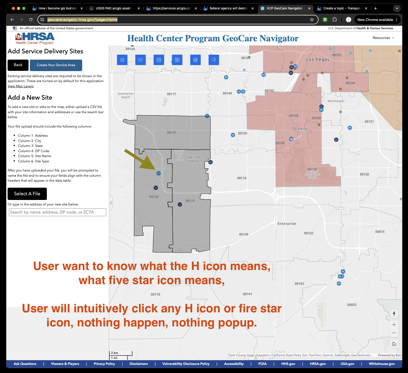
User want to know what the H icon means, what five star icon means,
User will intuitively click any H icon or five star icon, nothing happen, nothing popup. User went to dead end, going no where.
User then keep clicking same H icon several times, luckly popup something like this, unfortunately popup 2 things, one is for point hospital, one is for underneath polygon zip code polygon.
User don't want to see zip code polygon, user only click point, how comes you popup both point and polygon ?
User can't tell item 1 is for point or item 2 is for polygon, confusing again.
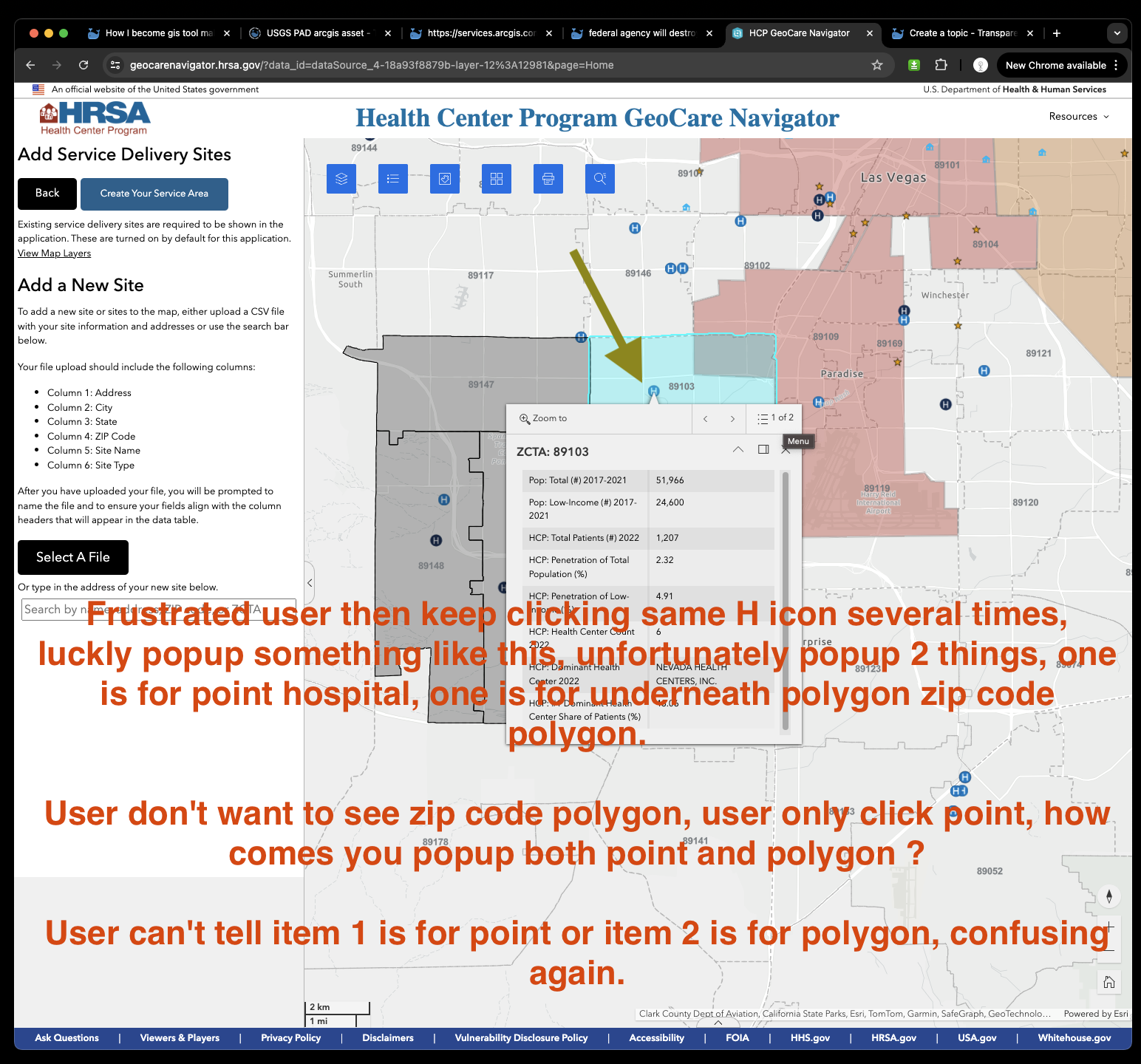
Original UDS mapper does not have these problem, because only when you select show info window will show popup, otherwise will select service area.
These are all fundermental and critial to usability.
What is most important things to user ?
In user's perspective:
All I want is to know what these five star are, what is their name, if I want to see details, I can click it to popup the details.
Sure, you can do that with my gis tools.
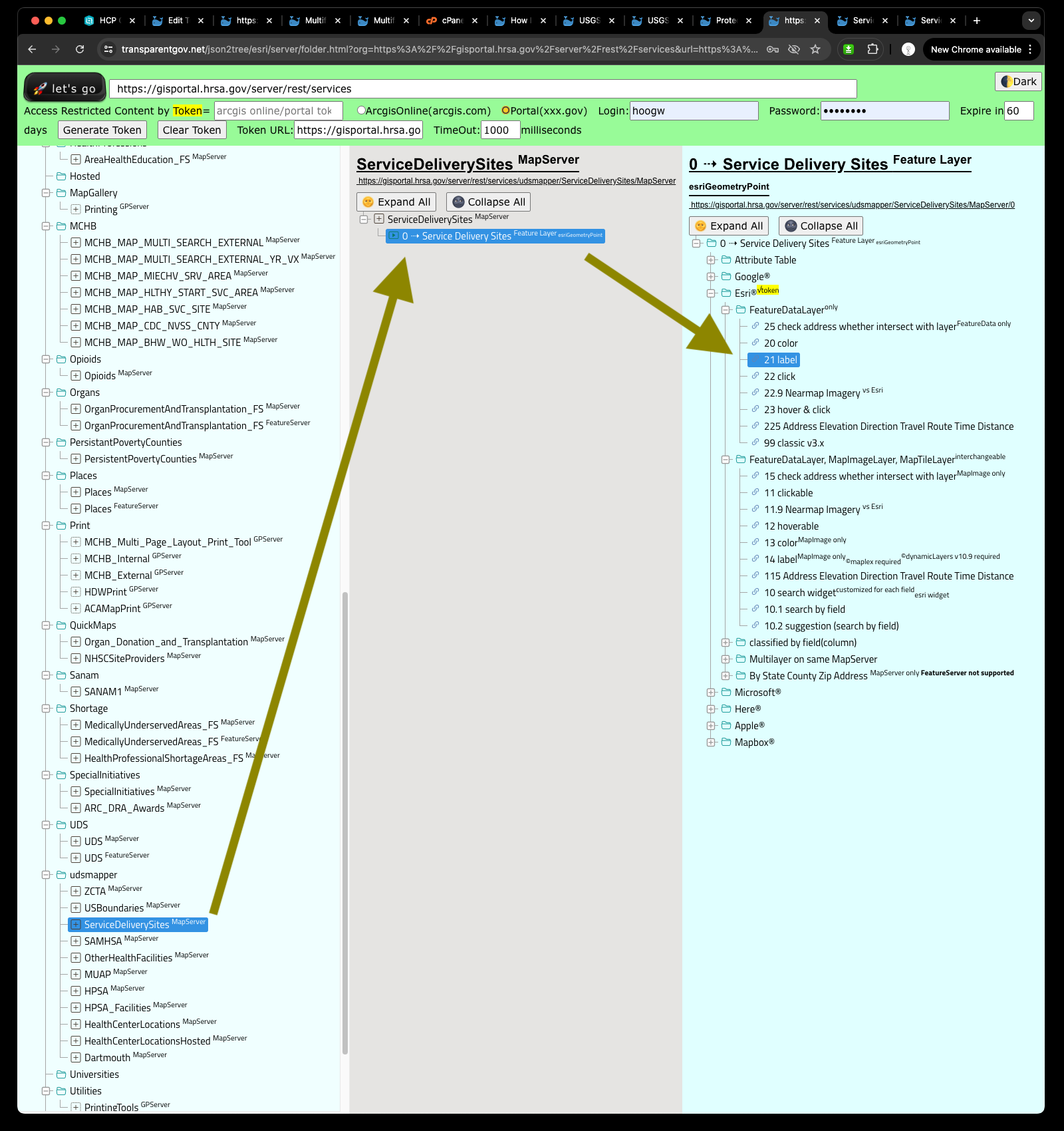
Option 1
use NO.21 which is client feature layer labeling, it will label all the point, polygon, line as your way.
https://transparentgov.net/json2tree/esri/server/folder.html?org=https%3A%2F%2Fgisportal.hrsa.gov%2Fserver%2Frest%2Fservices&url=https%3A%2F%2Fgisportal.hrsa.gov%2Fserver%2Frest%2Fservices&select_folder=38&select_layer=0&arcgis_online_token=
In this case, I want to see site name, which is clinic name.
https://transparentgov.net/json2tree/arcgis/featurelayer/label_feature.html?backgroundlayerurl=https%3A%2F%2Fgisportal.hrsa.gov%2Fserver%2Frest%2Fservices%2Fudsmapper%2FServiceDeliverySites%2FMapServer%2F0&_center_lat=30.291048752573214&_center_long=-81.63077582922367&_center_zoom=12&panto=0&symbolType=native&layer=Service+Delivery+Sites&dynamicLabelField=SITE_NM
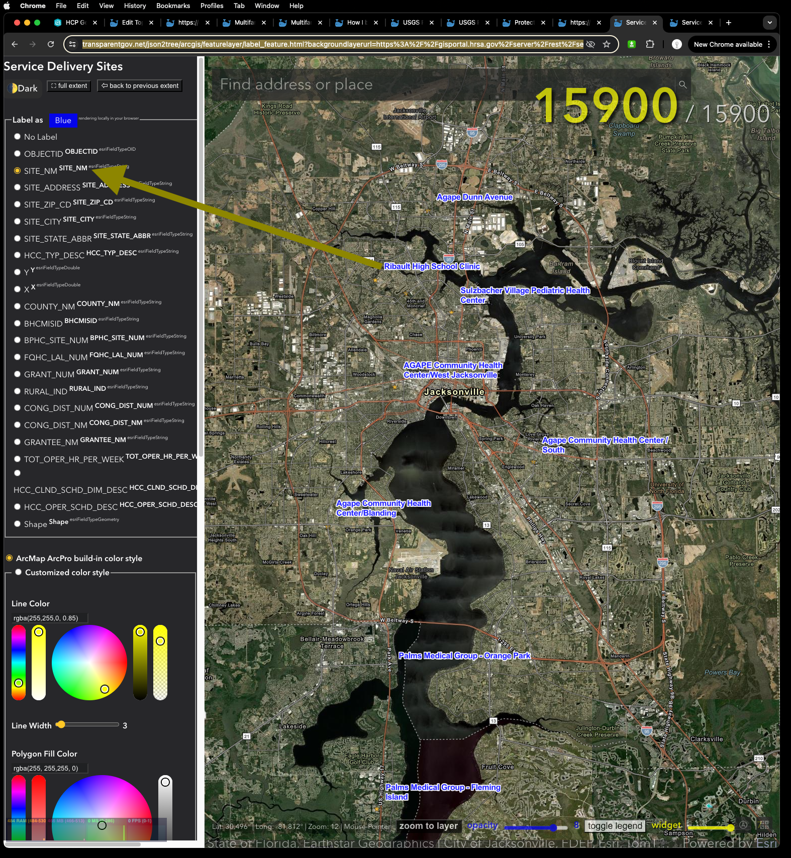
Official HRSA's little five star symbol is horrible to see, too small !!!! Without above I created client side label, I can't even find them on map !!!!
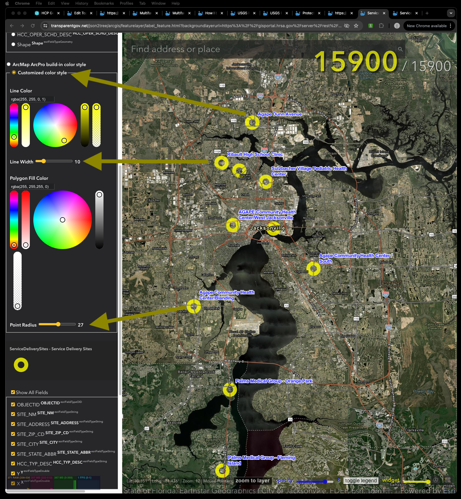
How about make five star larger, light color, more visible !!! Let's do it.
Select use customized color style
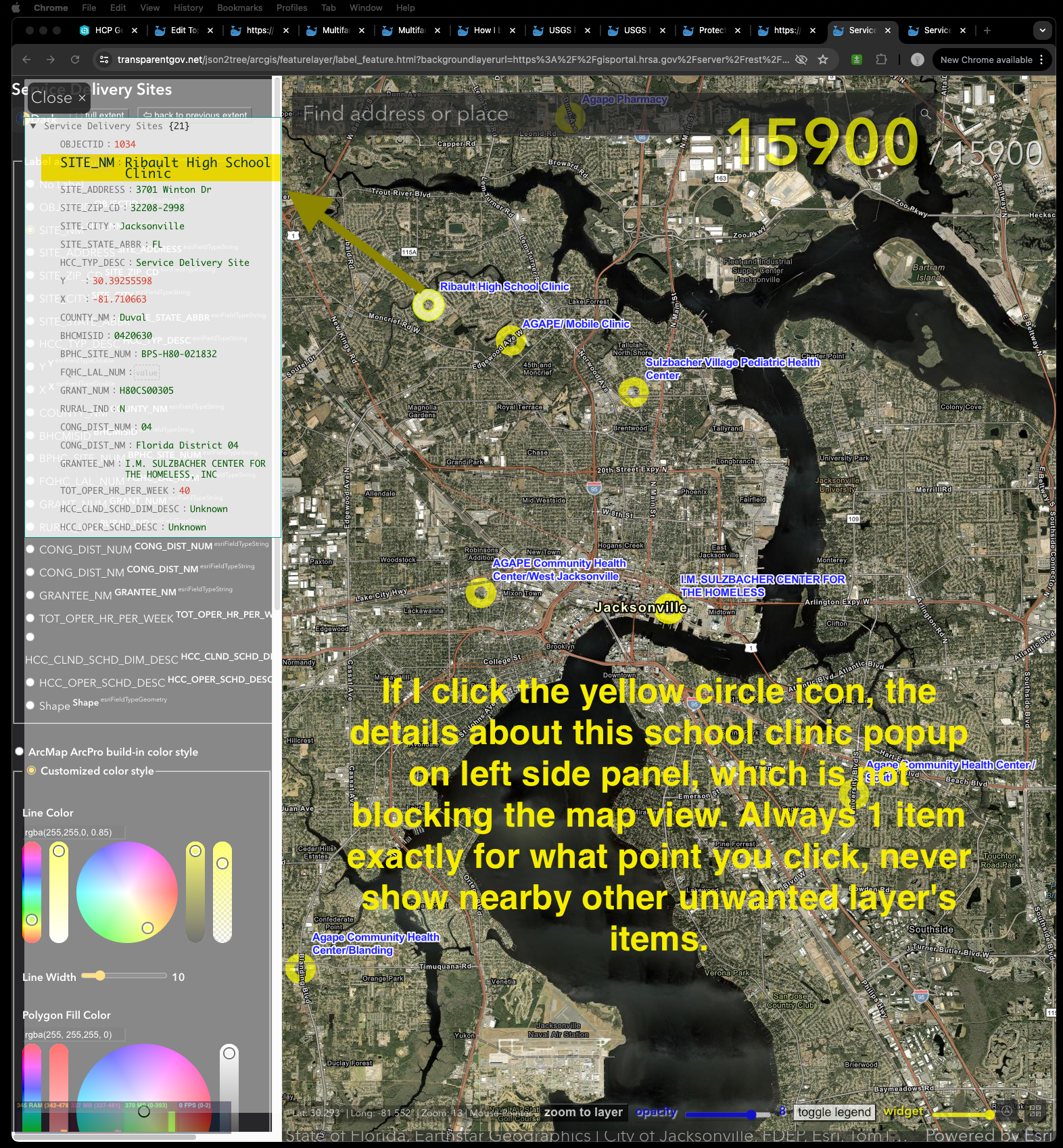
If I click the yellow circle icon, the details about this school clinic popup on left side panel, which is not blocking the map view. Always 1 item exactly for what point you click, never show nearby other unwanted layer's items.
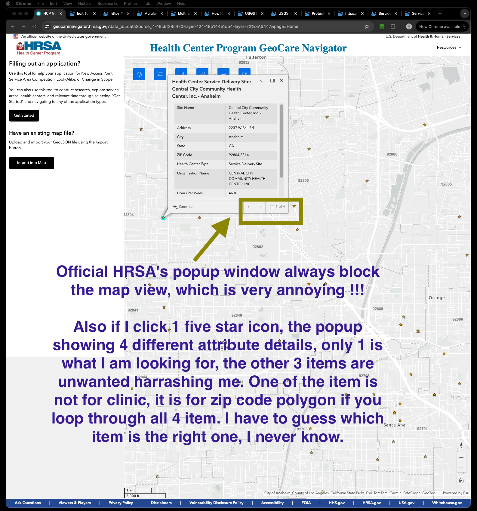
Official HRSA's popup window always block the map view, which is very annoying !!!
Also if I click 1 five star icon, the popup showing 4 different attribute details, only 1 is what I am looking for, the other 3 items are unwanted harrashing me. One of the item is not for clinic, it is for zip code polygon if you loop through all 4 item. I have to guess which item is the right one, I never know.
Option 2
use NO.14 which is server side map image layer labeling, the label is actually generated remotely on arcgis server, not in your browser. It is just a different way of display label.
https://transparentgov.net/json2tree/esri/server/folder.html?org=https%3A%2F%2Fgisportal.hrsa.gov%2Fserver%2Frest%2Fservices&url=https%3A%2F%2Fgisportal.hrsa.gov%2Fserver%2Frest%2Fservices&select_folder=38&select_layer=0&arcgis_online_token=
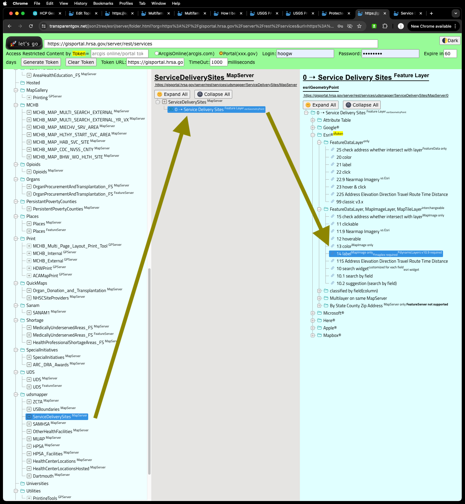
In this case, I want to see site name, which is clinic name.
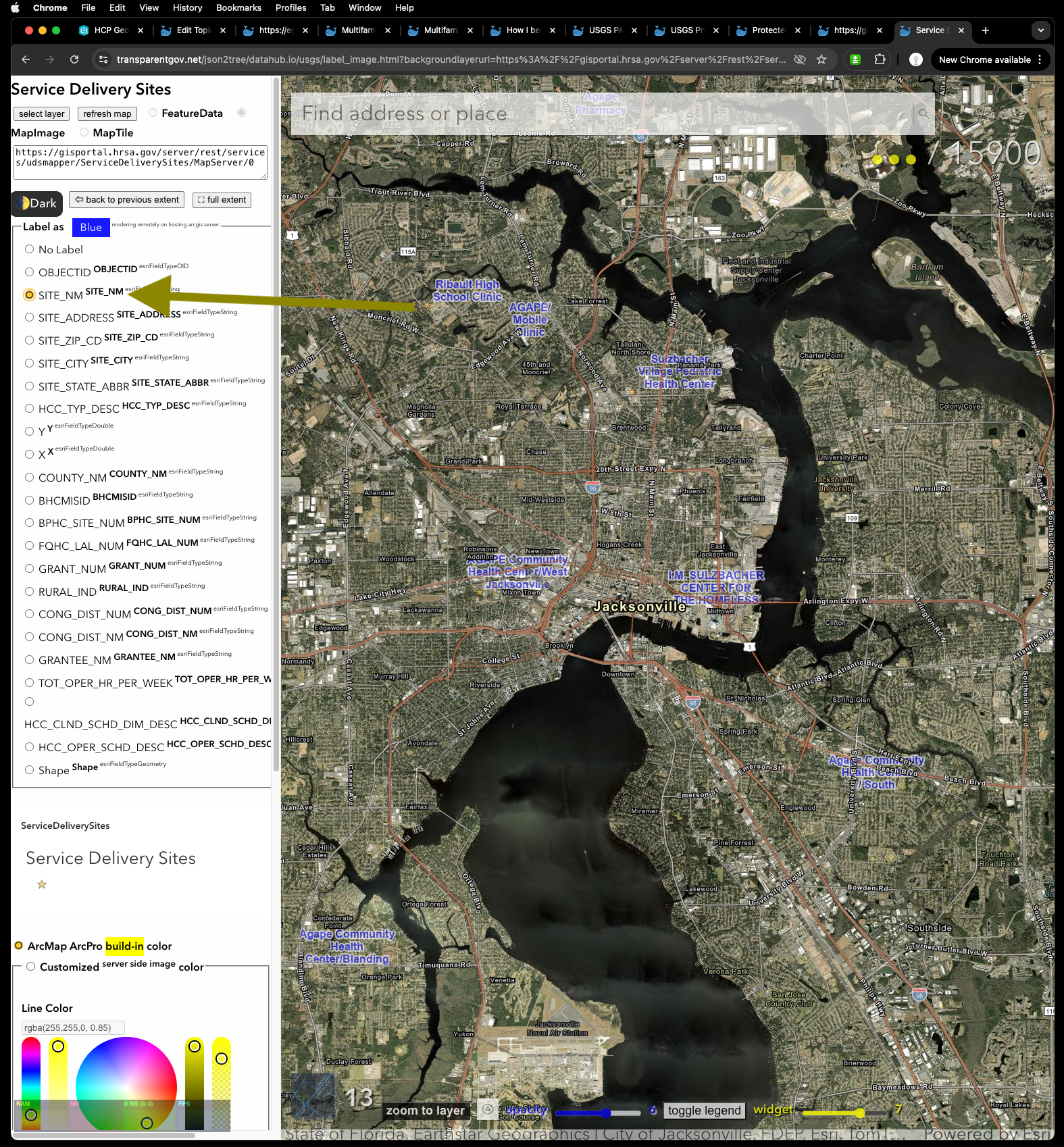
https://transparentgov.net/json2tree/datahub.io/usgs/label_image.html?backgroundlayerurl=https%3A%2F%2Fgisportal.hrsa.gov%2Fserver%2Frest%2Fservices%2Fudsmapper%2FServiceDeliverySites%2FMapServer%2F0&layer=Service+Delivery+Sites&dynamicLabelField=SITE_NM&_center_zoom=13&_center_lat=30.32602366000003&_center_long=-81.64957275&symbolType=native
Again
Official HRSA's little five star symbol is horrible to see, too small !!!! Without above I created client side label, I can't even find them on map !!!!
How about make five star larger, light color, more visible !!! Let's do it.
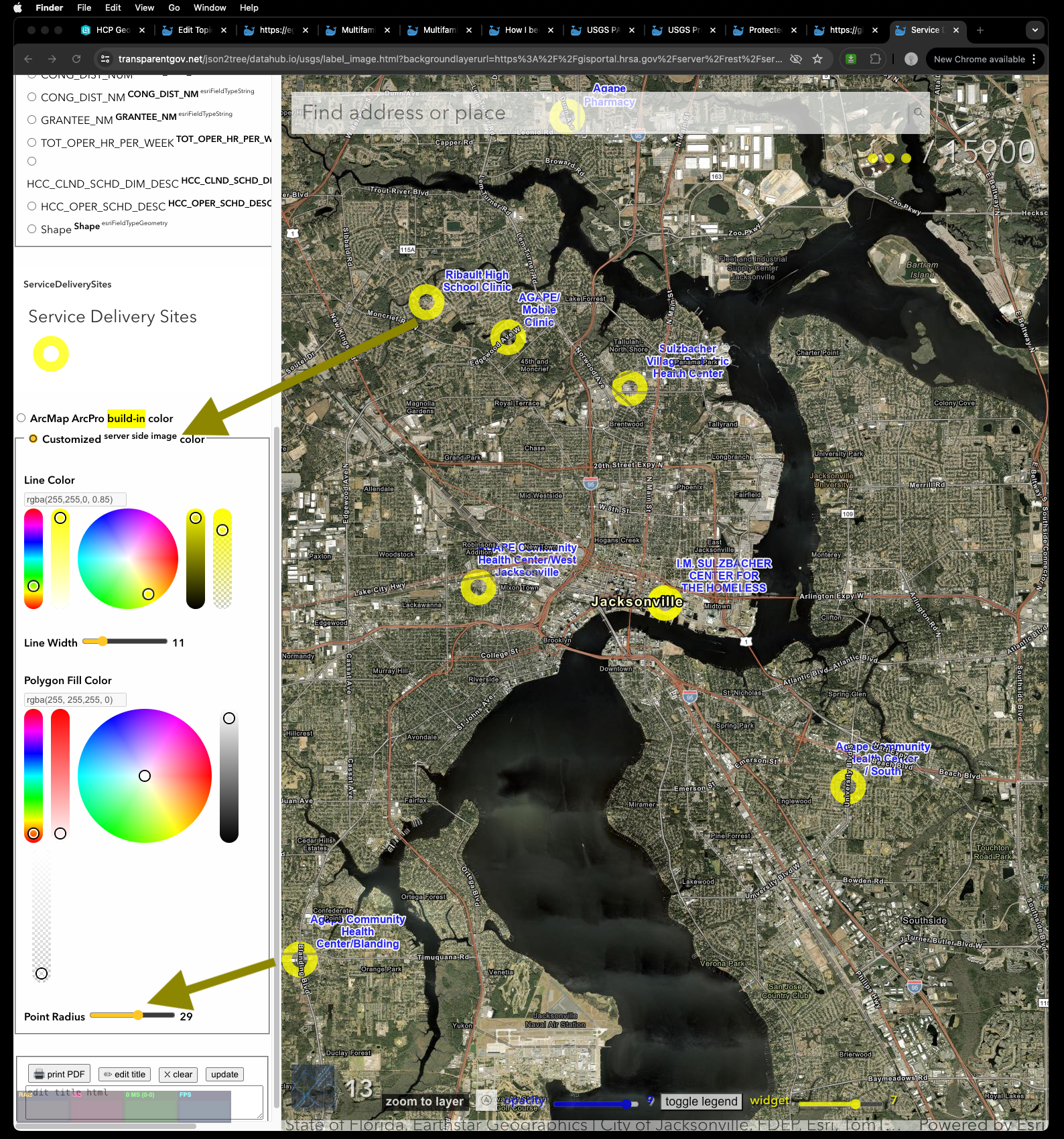
Select use customized color style
If you click yellow circle on map image, popup details with only 1 item, no unwanted other item, no guess, just the clinic you clicked. popup on left side panel, no block map view
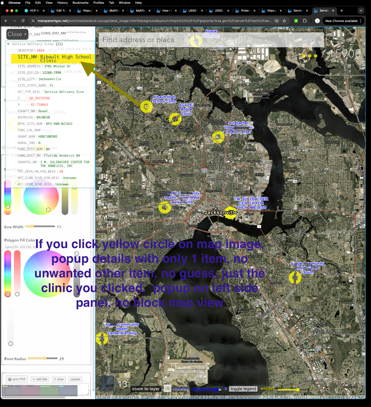
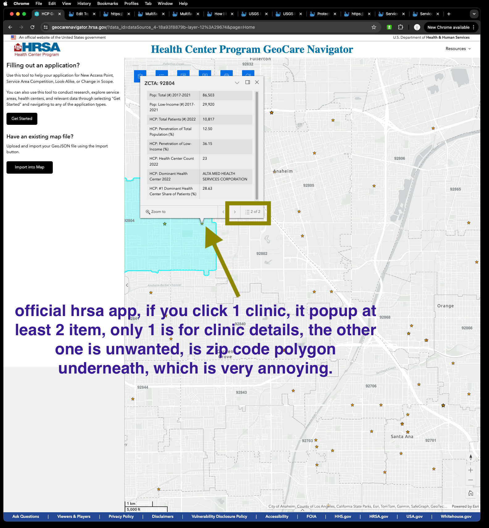
official hrsa app, if you click 1 clinic, it popup at least 2 item, only 1 is for clinic details, the other one is unwanted, is zip code polygon underneath, which is very annoying.