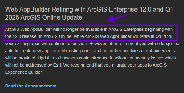
say bye to web app builder in Q1 2026, eneterprise 12.0

Why you should upgrade to experience builder from web appbuilder
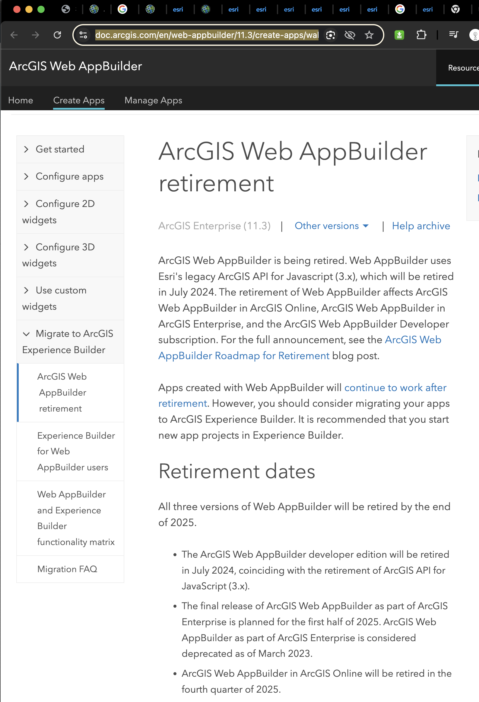
Here is why
https://doc.arcgis.com/en/web-appbuilder/11.3/create-apps/wab-retirement.htm

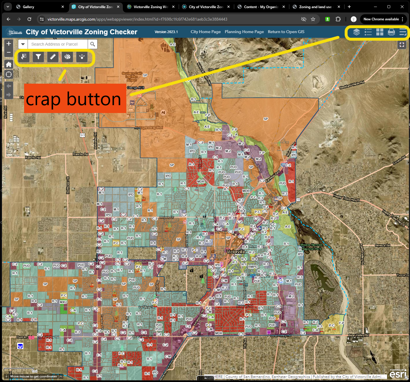
So you can avoid these crap button on every web appbuilder
Let's look at where is these crap button.

Keep in mind that this map's real user are not you, not GIS team, instead they are general public, city manager, department directors, city planer, etc
99% of chance they are not gis professional, 99% of chance, they are scare off by these crap button. They don't know what is the hell these button does.
So what, they lose the interest to continue using it after the first peek.
You successfully scare off them, discourage them.
Then you could blame them, it is becaue they don't have enough GIS knowledge to use it.
That is only right from your point of view.
But from user's point of view if you can't make complex thing as easiest as it is, it is your fault, not theirs.
Unfortunately with web appbuilder, you can't get rid of these crap buttons, since web appbuilder is like frozen pizza or frozen dinner,
You can change the way you heate it, either microwave, or stove, or oven, or pan, but you can't change its ingredient, these button are their build-in ingredient, it is fixed.
That is why every map made with web appbuilder has these crap button, no exception.
ESRI must know all about it, so introduced experience builder to address this issue.
The biggest improvement from web appbuilder to experience builder is:
Experience builder use panel widget, which is resizable, dragable.
That means all widget is movable, you can re-position it in anywhere within map or outside of map. Also all widget is resizable, means you can drag the corner of panel to make it larger or smaller.
Web appbuilder use button widget, which is fix size button as you see previously those crap buttons.
When you click the button, it pop up a fix size panel.
All button widget is fix size, fix positioned.
That means you can only change the order of button, for example button 1, button 2, button 3 can be changed to button 3,2,1. But you can't change the size of button.
You can have max 5 button on map. These button position is fixed, always like that when you choose one layout.
You don't have an option to not choose layout. That is why all 3000+ counties, 20000 cities's web appbuilder apps are all looks the same, because there are only around 10 template(layout) available.
On average 1 template could be used by 300+ counties, 2000+ cities. Looks like uniform, they wear the exact same T-shirt between each other.
When you click the button, a popup window shows up. The popup window is also fix size. You can't make it bigger or smaller. The position is also fixed. You can't move it around.
Experience builder improved by giving you an option not to choose template(layout). Also every widget is resizable and movable. That means, each of 20000 city and 3000 county can create unique layout. You don't have to wear the same jacket as other people's any more. More freedom ? Yes, but still far away from complete free !
check out my other post
is experience builder really good for you ?
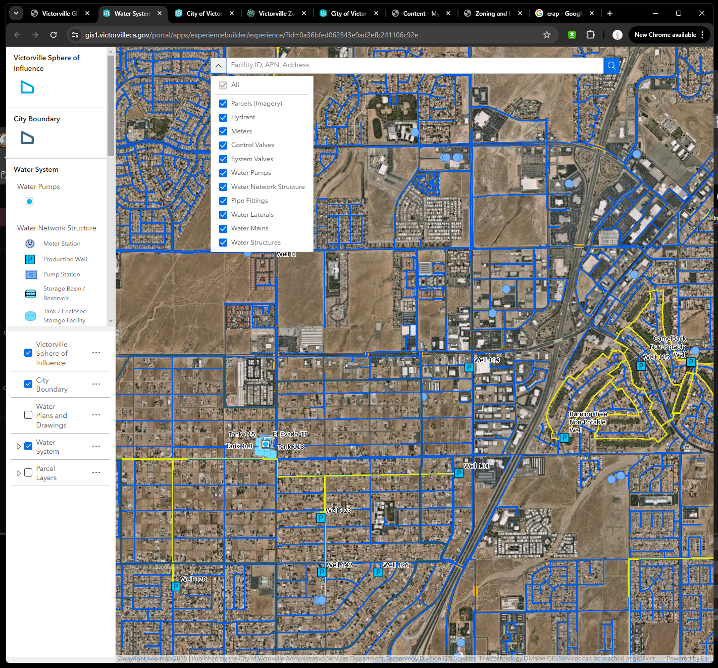
Here is what I designed with exact same functionality but use experience builder panel widget

No more crap buttons, even the idiot by first glimpse should have the idea what this map is talking about, what layer it has, what color, what symbol means.
Here is my map design principle
Simplest beat all
If you can convert most complicated business logic behind into the simplest form. Your design obviously beat all others.
Tesla has much less button than traditional gas car while performing much more complicated business logic behind like autopolit full self-driving etc that traditional gas car don't have. Tesla beat all other brands has a reason.
Simplest last longest
Because it has the least moving parts, is least likely broken.
If you don't know which one to choose, choose the simplest and you never go wrong.
why simple is best, click here
Simplest will make you benefit in the long run.
If you can use the simplest manner presenting or explainning the most complex thing.
That means you get it. Otherwise, you don't.