Conclusion:
After evaluate compare experience builder app with native arcgis javascript api app,
Native api app have more freedom, give you room to create more intuitive, easy to use app.
Experience builder due to its design limitation, a lots of intuitive design you can't apply here. The build in widget in experience builder is fixed, such as layer selection widget, legend widget, both of them are awkward to use, you can't changed it.
Why you need intuitive app?
Intuitive app will eliminate user training, is critcal to increase user usage,
intuitive will give user comfortable experience
awkward design hard to use, horrible user experience, scare user away
Following compare the intuitive, easy to use
1) how to select service area
https://geocarenavigator.hrsa.gov/?page=Home
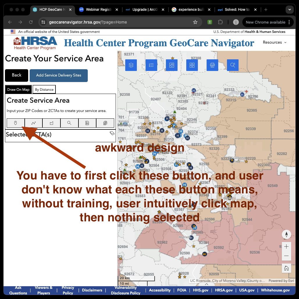
awkward design
You have to first click these button, and user don't know what each these button means, without training, user intuitively click map, then nothing selected
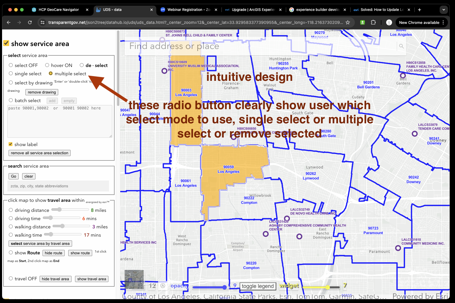
intuitive design
these radio button clearly show user which select mode to use, single select or multiple select or remove selected
https://transparentgov.net/json2tree/datahub.io/uds/uds_data.html?_center_zoom=13&_center_lat=33.928799999999995&_center_long=-118.2468
2) how to select service center and show the service area that center covered
https://geocarenavigator.hrsa.gov/?page=Home
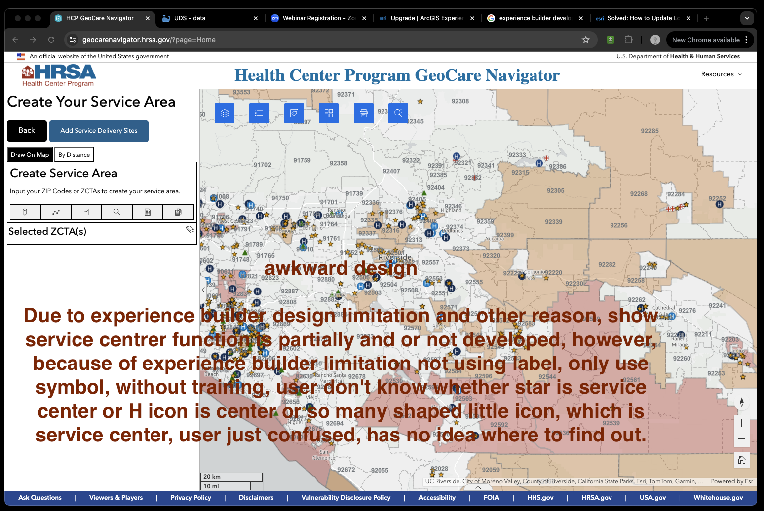
awkward design
Due to experience builder design limitation and other reason, show service centrer function is partially and or not developed, however, because of experience builder limitation not using label, only use symbol, without training, user don't know whether star is service center or H icon is center or so many shaped little icon, which is service center, user just confused, has no idea where to find out.
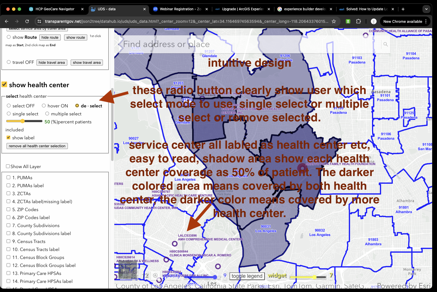
intuitive design
these radio button clearly show user which select mode to use, single select or multiple select or remove selected.
service center all labled as health center etc, easy to read, shadow area show each health center coverage as 50% of patient. The darker colored area means covered by both health center, the darker color means covered by more health center.
https://transparentgov.net/json2tree/datahub.io/uds/uds_data.html?_center_zoom=13&_center_lat=33.928799999999995&_center_long=-118.2468
3) how to change layer
https://geocarenavigator.hrsa.gov/?page=Home
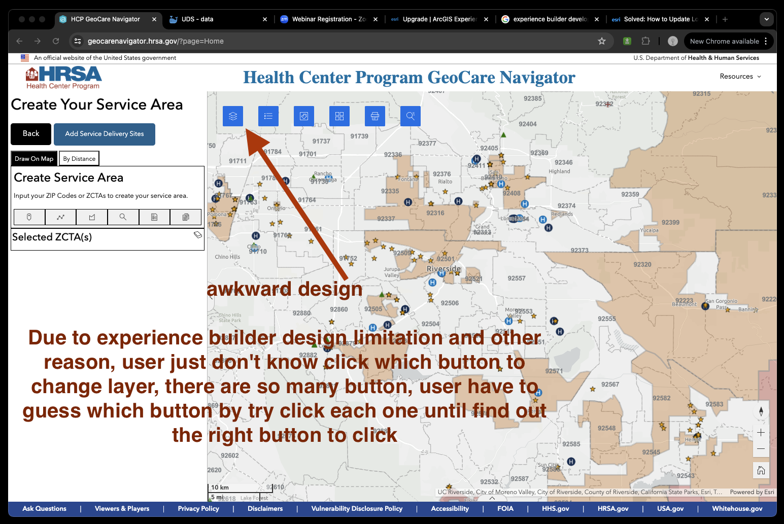
awkward design
Due to experience builder design limitation and other reason, user just don't know click which button to change layer, there are so many button, user have to guess which button by try click each one until find out the right button to click
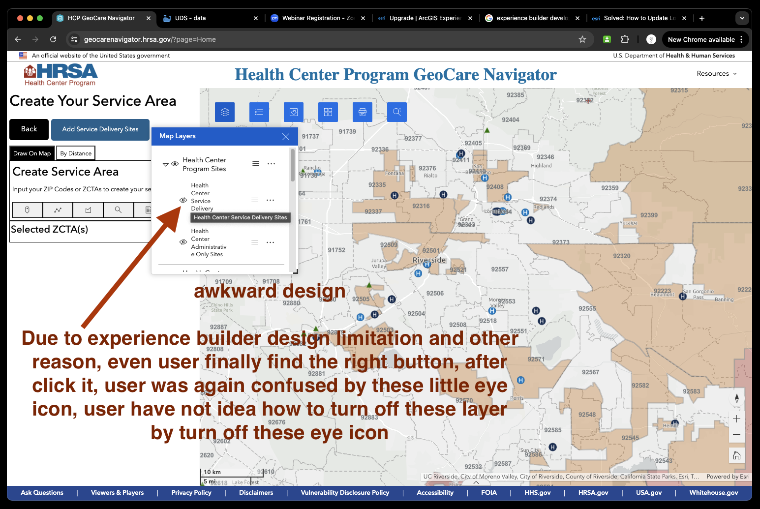
awkward design
Due to experience builder design limitation and other reason, even user finally find the right button, after click it, user was again confused by these little eye icon, user have not idea how to turn off these layer by turn off these eye icon
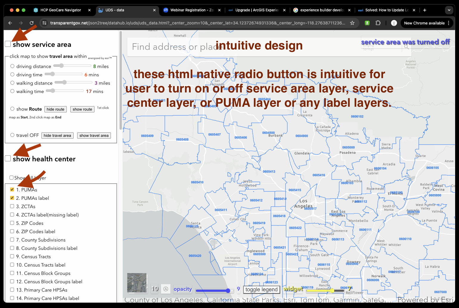
intuitive design
these html native radio button is intuitive for user to turn on or off service area layer, service center layer, or PUMA layer or any label layers.
https://transparentgov.net/json2tree/datahub.io/uds/uds_data.html?_center_zoom=13&_center_lat=33.928799999999995&_center_long=-118.2468
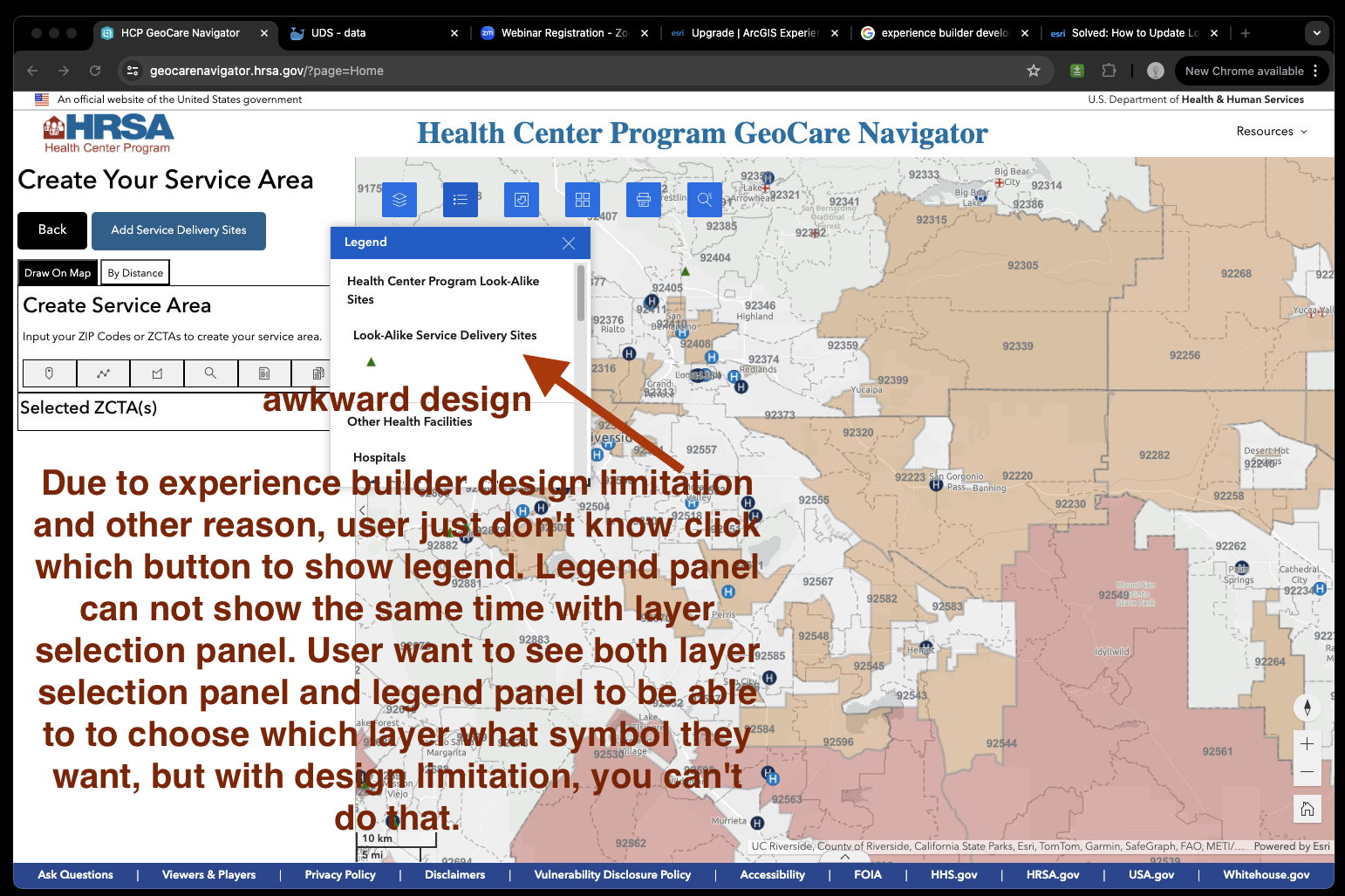
4) where is legend
https://geocarenavigator.hrsa.gov/?page=Home
awkward design
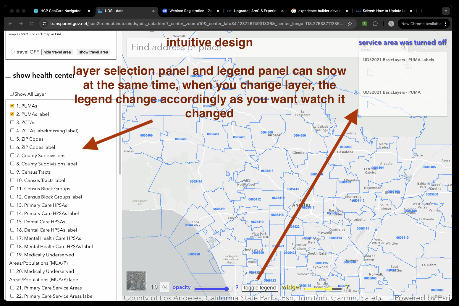
Due to experience builder design limitation and other reason, user just don't know click which button to show legend. Legend panel can not show the same time with layer selection panel. User want to see both layer selection panel and legend panel to be able to to choose which layer what symbol they want, but with design limitation, you can't do that.
intuitive design
layer selection panel and legend panel can show at the same time, when you change layer, the legend change accordingly as you want watch it changed
https://transparentgov.net/json2tree/datahub.io/uds/uds_data.html?_center_zoom=13&_center_lat=33.928799999999995&_center_long=-118.2468
