Experience builder's design has its limitation, these limitation result into overall awkward design.
hrsa uds mapper use experience builder, because of widget limitation, you can't select multiple service area by just continuing click on the map.
If I use native javascript api I can do continuing multiple select service area
Due to experience builder's widget limitation, you can't remove a service area by just click the one that you want to remove on map.
If I use native js api, I can do that.
In the experience builder, you have to always click single select icon button first then click on map. If you want select another one, you can't just click on map, instead you have to click single select icon button again, then click on map.
https://geocarenavigator.hrsa.gov/?page=Home
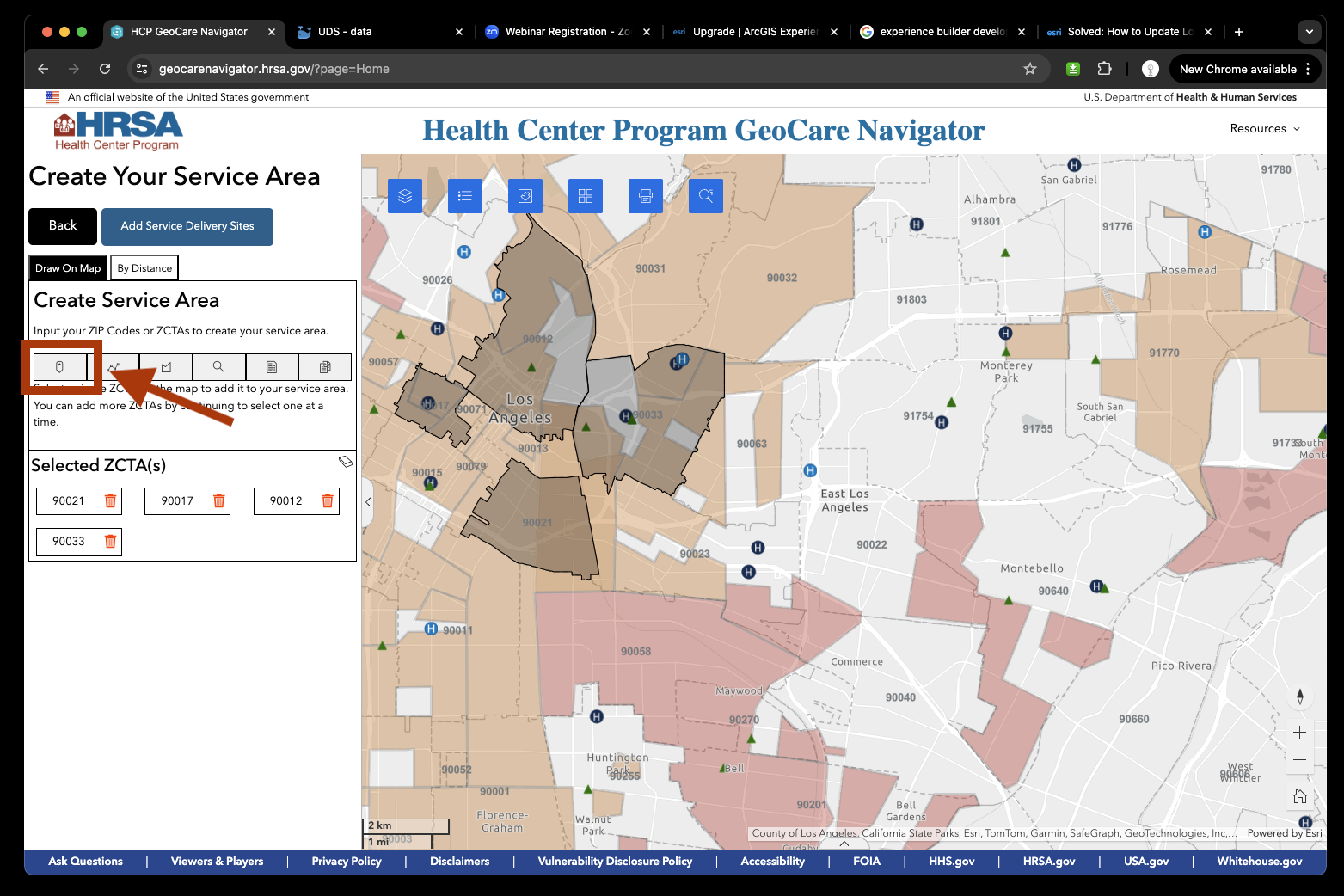
Why this awkward design is because the single select tool is actually use point drawing widget.
Not use real select action out of native javascript api. User not real select polygon. Each widget has start event and end event. when you click icon button, fired widget start event, when you click on map, widget end event fired. After end event fired, everything is ended. You want to continue select other polygon, you have to start over the process again by click left panel single select icon again. That is why you can't select multiple polygon unless you click single select icon button again. This is not intuitive, awkward design due to experience limitation.
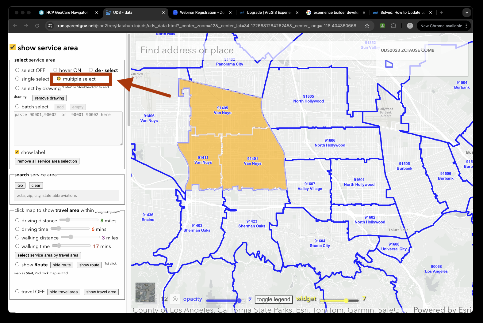
Use native arcgis javascript api, I can solve this bottle neck
as long as you set multiple select mode, you can continue select multiple service area polygon by continuing multiple click polygon on map. This is intuitive design.
https://transparentgov.net/json2tree/datahub.io/uds/uds_data.html?_center_zoom=12&_center_lat=34.172668128426245&_center_long=-118.40436066888564&tooltype=multiple_select&showHealthCenter=hide&showServiceArea=show
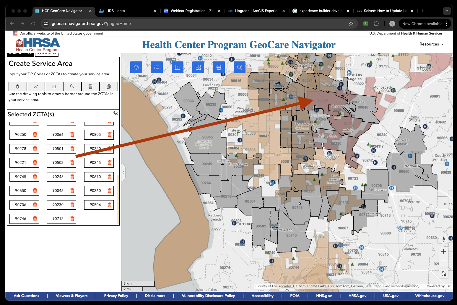
Removing selected service area
Because experience builder actually use drawing widget as select tool, you can't use same widget to do opposite operation ( removal ). This bottleneck result in another awkward design. If I want to remove for example zip code polygon 90058 on this map, I have to look for 90058 on the left panel list first. I have hundred zipcode, they are not alphabetic ordered, it is really hard to find 1 in hundred un-ordered zipcode list. see picture
https://geocarenavigator.hrsa.gov/?page=Home
Use native arcgis javascript api, I can solve this bottle neck
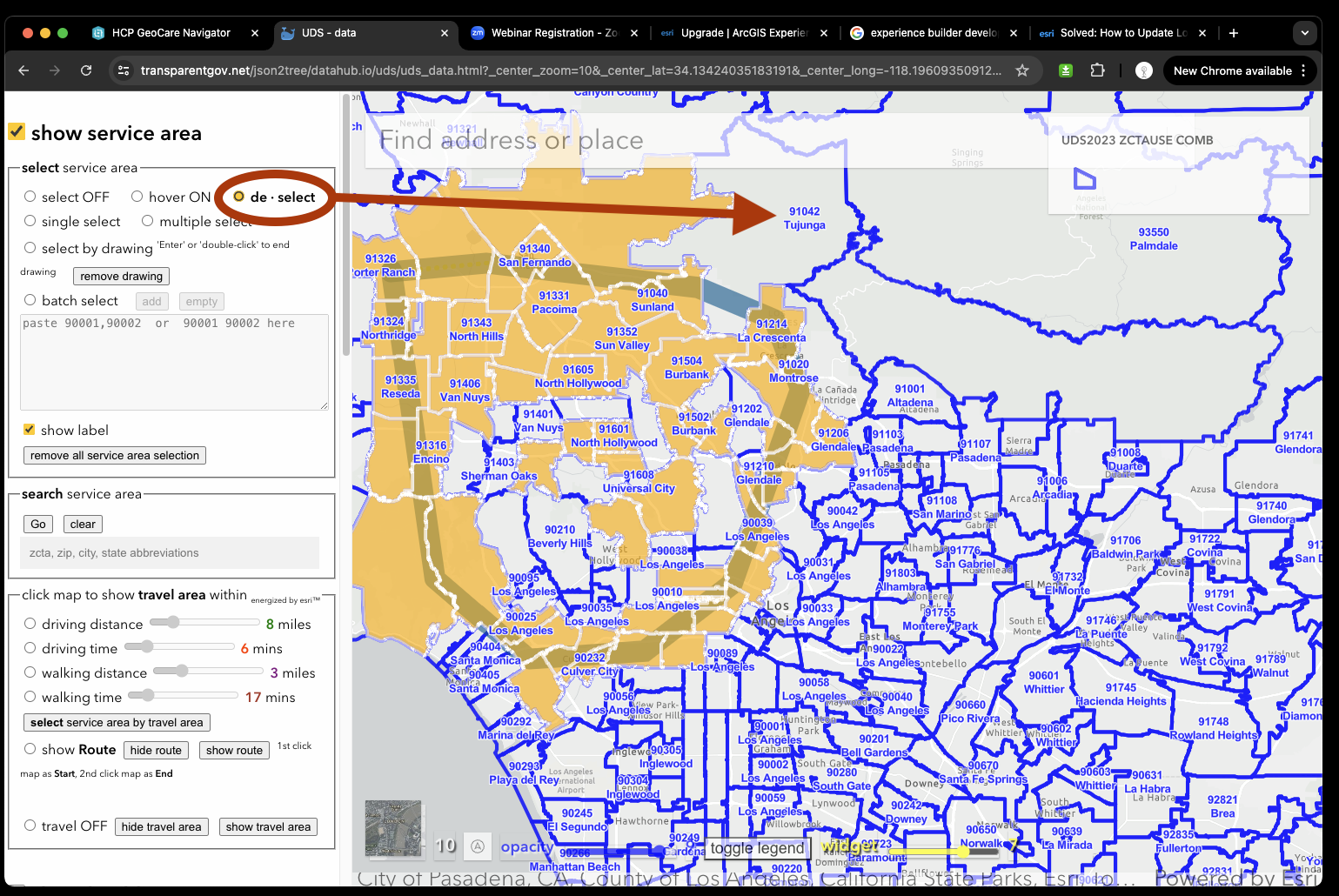
If I want to remvoe zipcode 91042, I set de-select mode, then intuitively click polylgon zipcode 91042 on the map, it will get removed from selection. This is natural intuitive design compare from experience version.
https://transparentgov.net/json2tree/datahub.io/uds/uds_data.html?_center_zoom=10&_center_lat=34.13424035183191&_center_long=-118.19609350912546&tooltype=deselect&showHealthCenter=hide&showServiceArea=show
Experience version hard to find health center
By just looking this map, do you know where is health center? triangle or circle H, circle H has different color, what they means?
You don't know! Perfect you need to join free hrsa training to know it.
Have you ever attend google map training before you use google map? no you can just use it fine.
Have you ever attend zillow map, redfin map training ? no. You can just use zillow, redfine fine without training.
Why?
This is because google map, zillow, redfin map has intuitive design, easy to use, no need training.
But experience builder app, because of its widget is pre-builder, some are awkward design, result into your app also has awkward design, user can't even find where is health center ( which is one to two most important layer ) without free training.
https://geocarenavigator.hrsa.gov/?page=Home
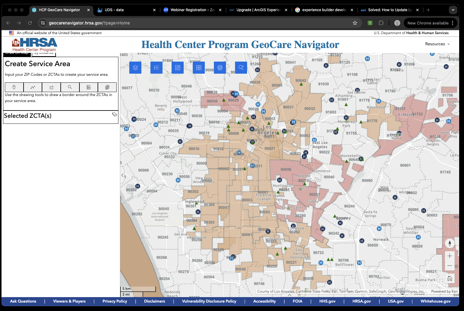
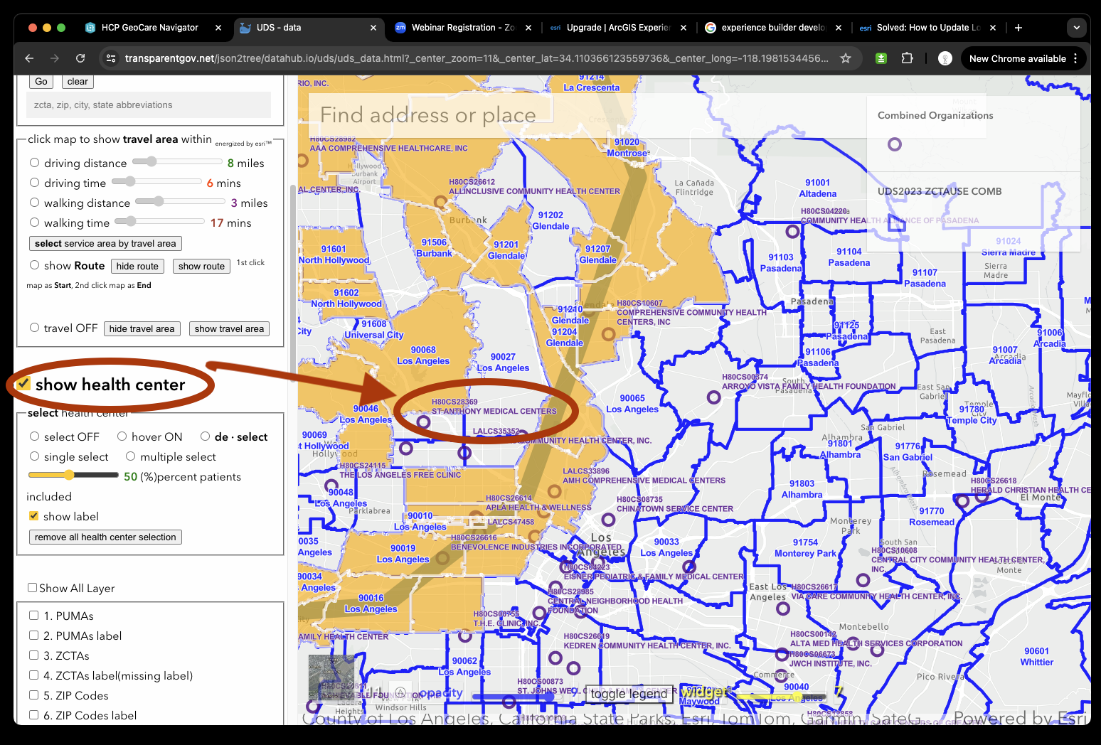
Health center does not have center name as label due to experience builer's limitation, this is awkward design.
Use native arcgis javascript api, I can solve this bottleneck
Without training, user click show health center checkbox, all those circle are health center, also has center name label.
Show health center checkbox is internet standard checkbox, public user familiar how to use checkbox without training.
This is intuitive design eliminate the need to teach user how to show health center layer.
Also every health center is labeled as name, intuitive design again as google map.
https://transparentgov.net/json2tree/datahub.io/uds/uds_data.html?_center_zoom=11&_center_lat=34.110366123559736&_center_long=-118.19815344564894&tooltype=deselect&showHealthCenter=show&showServiceArea=show
