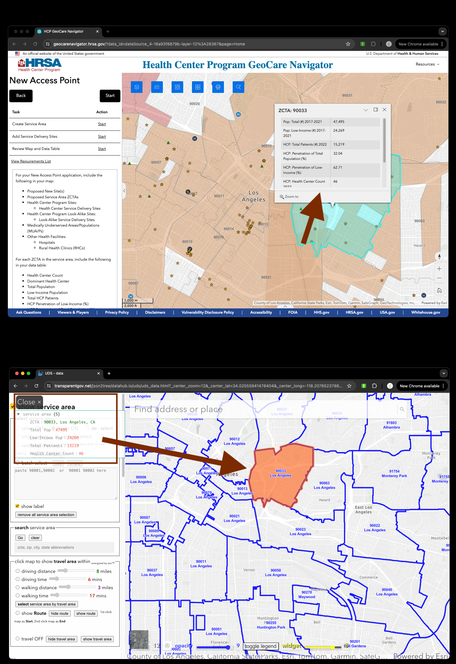
1) Review service area difference
Experience builder version
1) Info window popup on map, block the map view
2) popup can only be fired by click
Native arcgis javascript api version
1) Info window popup on left top corner, does not block the map view
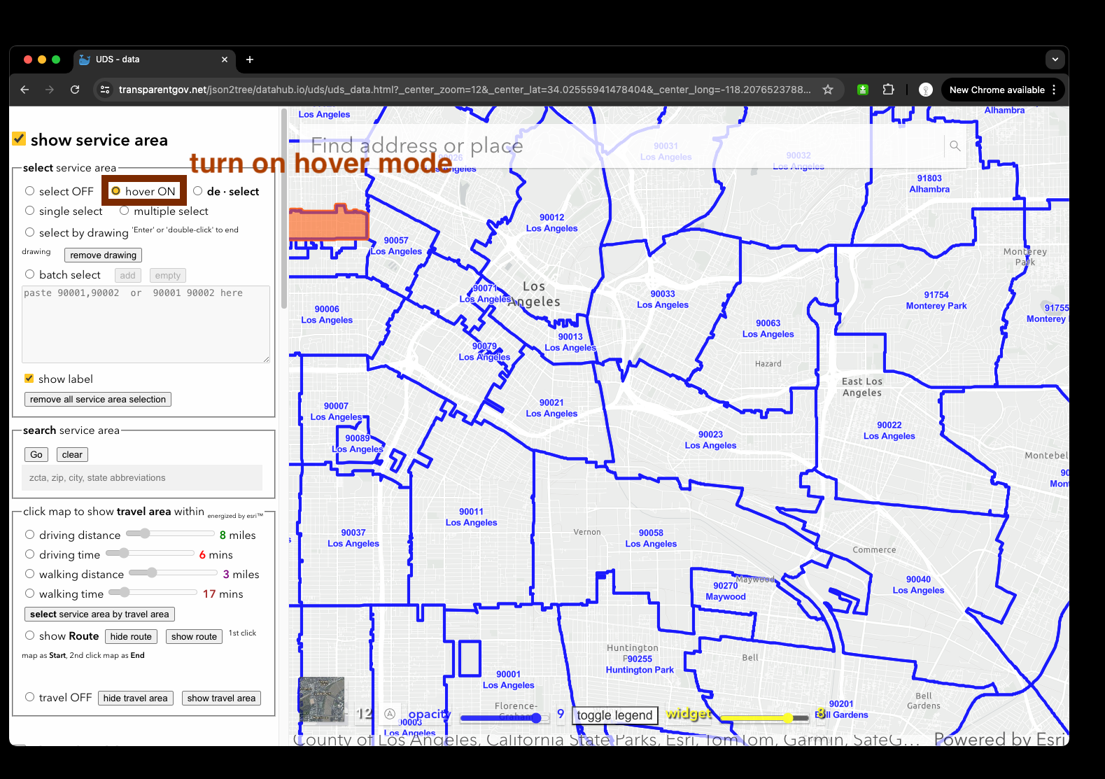
2) popup can be triggered by user mouse hover the polygon for quick review polygon details
Experience builder version is here
https://geocarenavigator.hrsa.gov/?page=Home
Native arcgis javascript api version is here
https://transparentgov.net/json2tree/datahub.io/uds/uds_data.html?_center_zoom=14&_center_lat=34.06400801424582&_center_long=-118.23415417553673&tooltype=off_select2&showHealthCenter=hide&showServiceArea=hide
2) Review health center difference
Experience builder version
1) click health center, popup 3 info window, only 1 info window is about health center, other 2 info window is not about health center, user confused why show other un-related info window and which is the one I am looking for. This awkward design is due to experience builder's limitation.
2) health center has no label, use five star icon, no one know five star icon means health center. Use just have no idea, where is health center, which is health center.
Native arcgis javascript api version
1) always one heath center info window popup on left top corner, no confusing, no block map view
2) popup can be triggered by user mouse hover the polygon for quick review polygon details, intuitive design
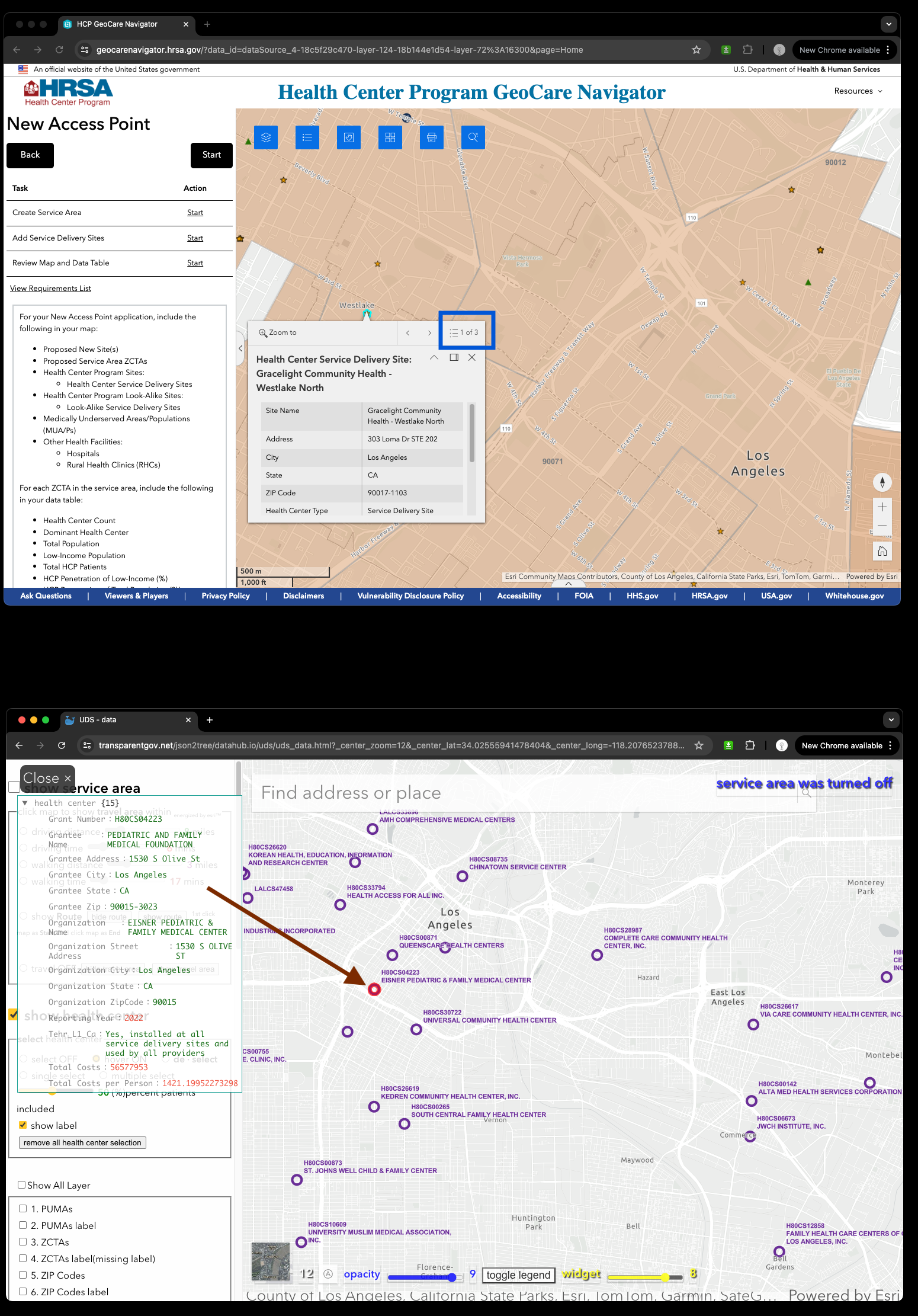
How to turn on service center layer and review details by hover circle point feature, label is already there by default
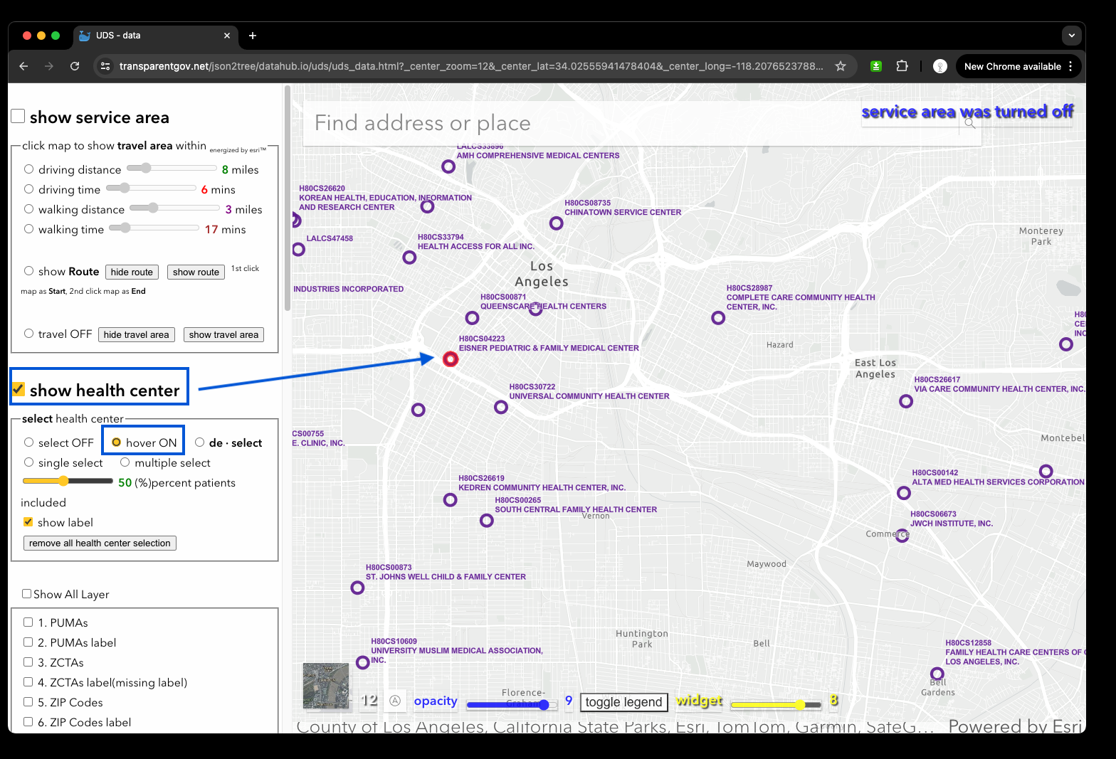
A good example to explain
why label is intuitive design,
symbol icon is bad, awkward design
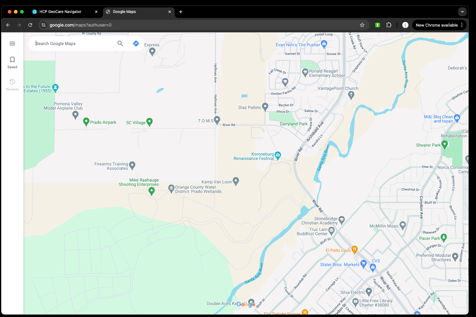
2022 year and before Apple map was use icon is huge design flaw. You have to click icon to see wether it is walmart or homedepot. Now apple map correct this flaw by adding label next to icon
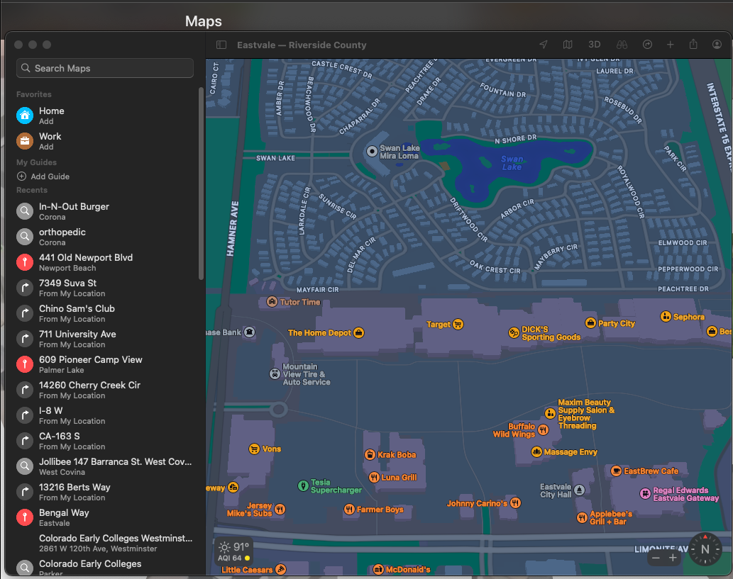
Google map has intuitive design, use label only, no icon, user can visually tell what is store name without any click.
