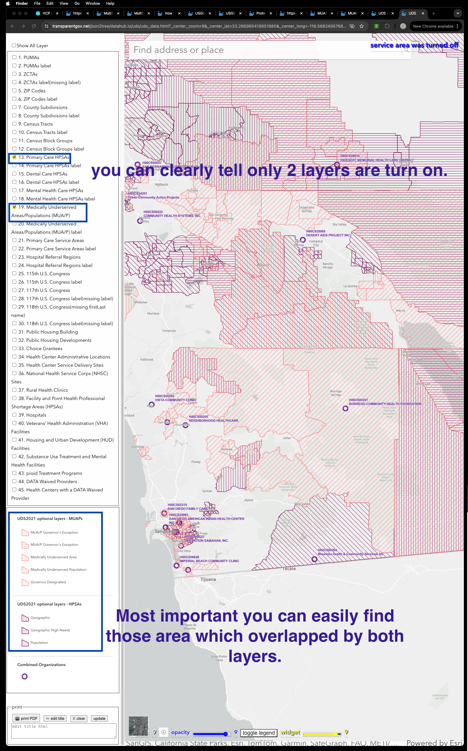
Official site is here
https://geocarenavigator.hrsa.gov/?page=Home
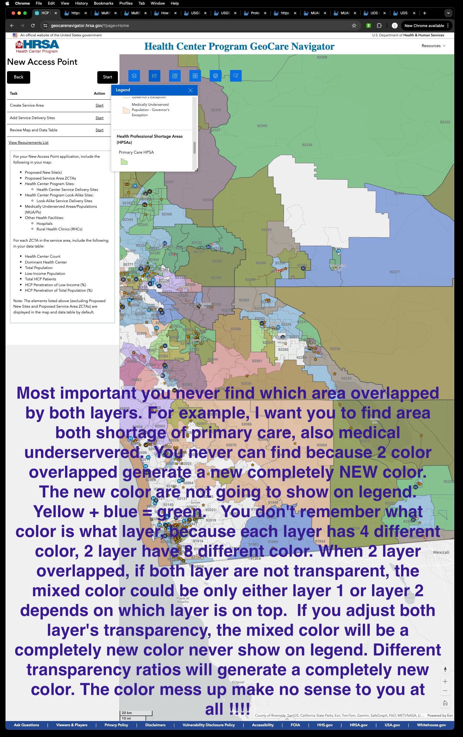
When you as user see this,
you are shocked, so many color, beautiful,
but you don't know what each color means.
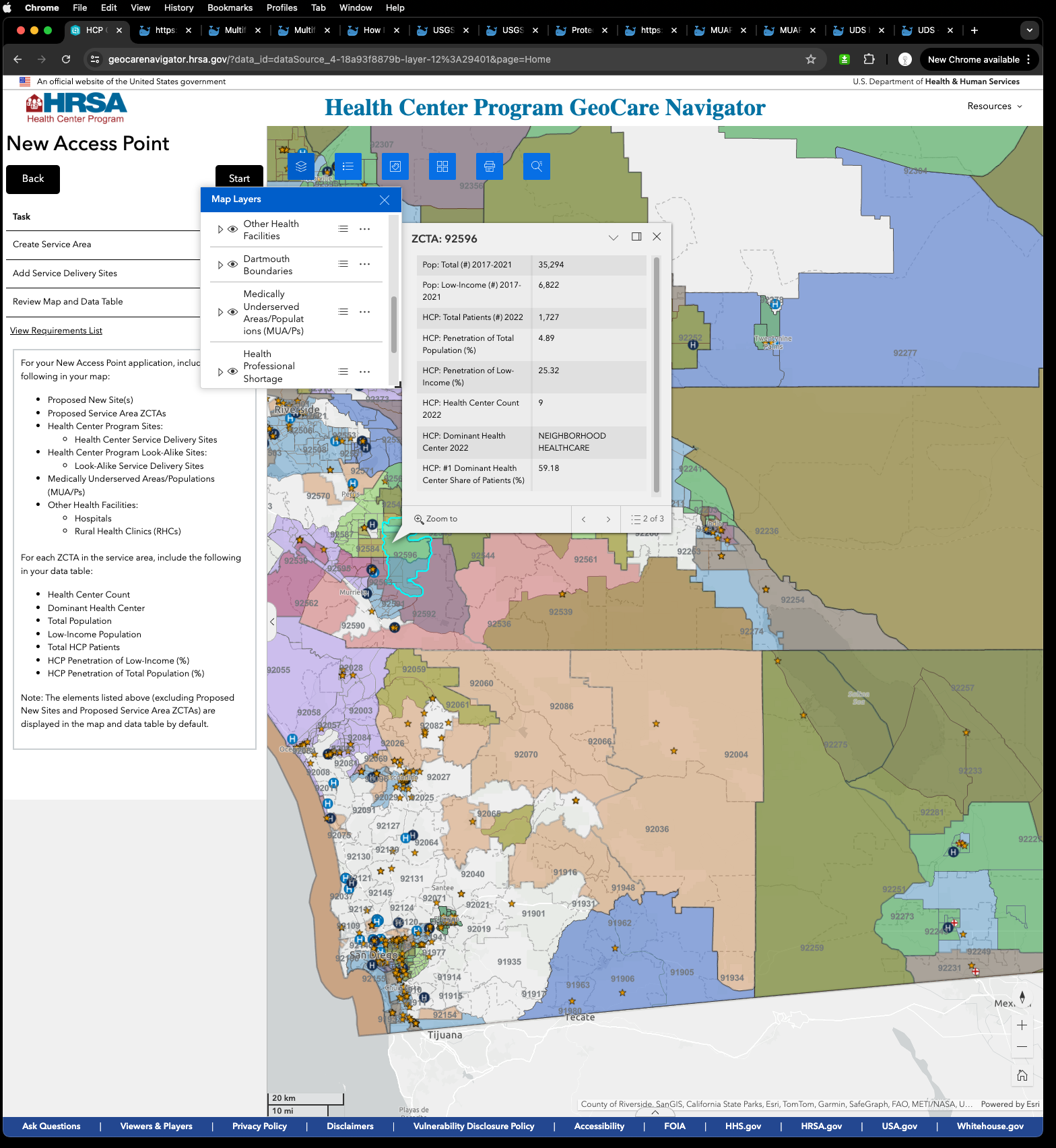
Most of public user don't know how to open layer frame.
Assume user attend ESRI training knows how to open layer frame, there are 50 layers user don't know these color comes from which layer.
User click each layer eye icon, open it. Also click open legend icon to show color.
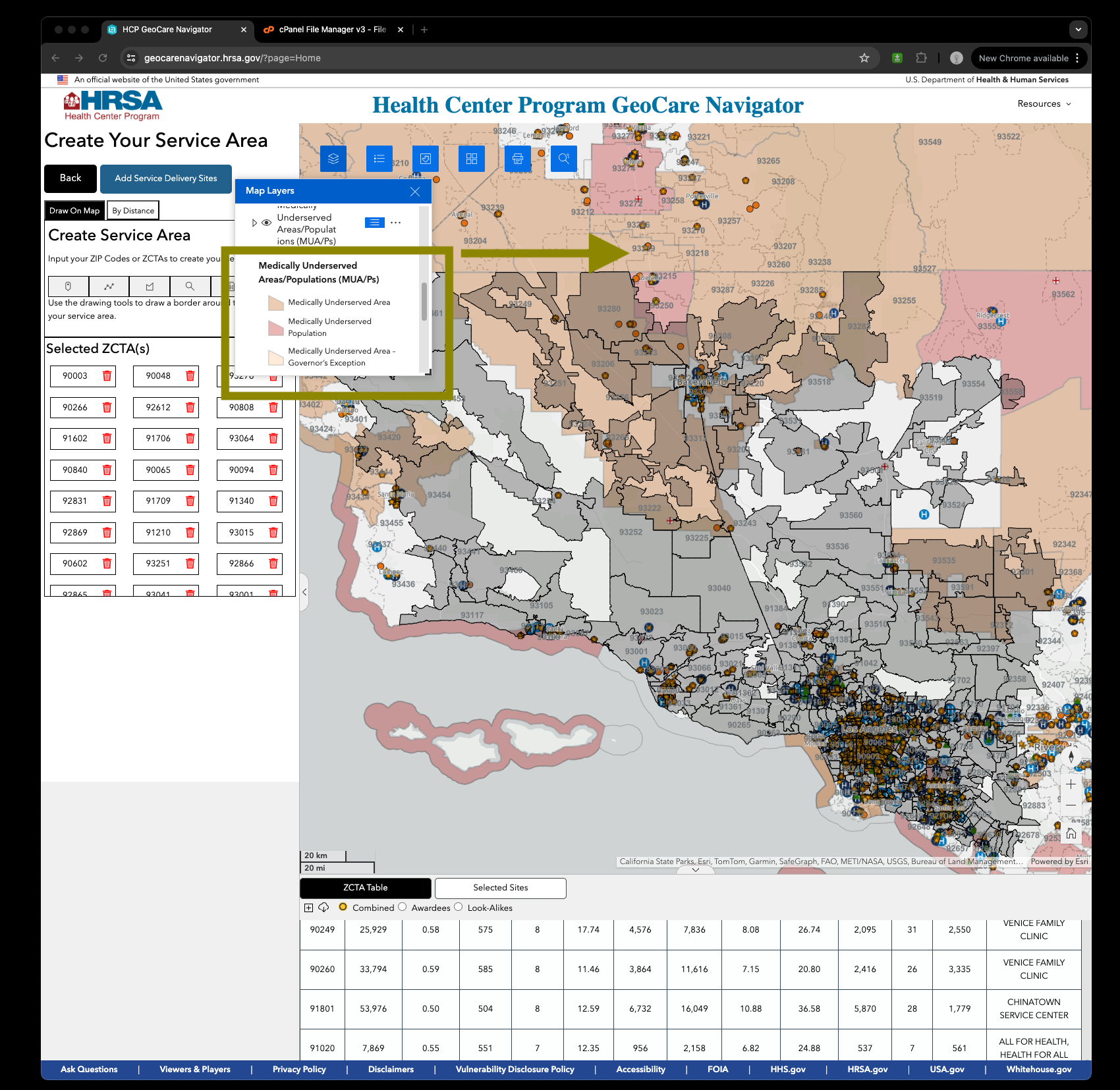
Currently only 2 layers open, but from this layer frame, you can't tell, all layers eye icon are open. You never know what color comes from which layer, they all similar color.
Most important you never find which area overlapped by both layers.
For example, I want you to find area both shortage of primary care, also medical underservered.
You never can find because 2 color overlapped generate a completely NEW color.
The new color are not going to show on legend.
Yellow + blue = green.
You don't remember what color is what layer, because each layer has 4 different color, 2 layer have 8 different color.
When 2 layer overlapped, if both layer are not transparent, the mixed color could be only either layer 1 or layer 2 depends on which layer is on top. Top layer color always block underneath layer's color.
If you adjust both layer's transparency, the mixed color will be a completely new color never show on legend.
Different transparency ratios will generate a completely new color. The color mess up make no sense to you at all !!!!
Original Design does not have these problem.
Here is why.
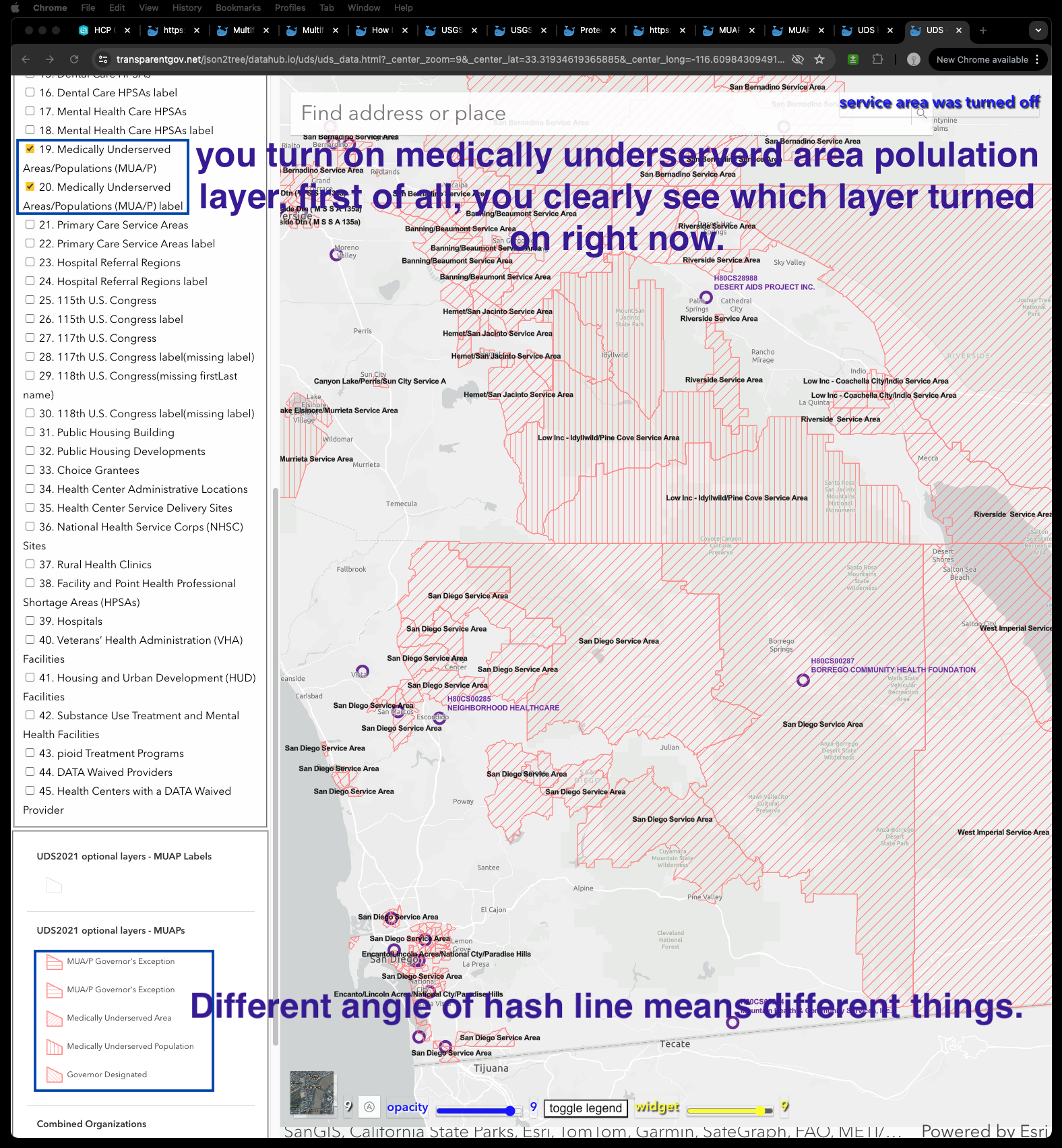
Original Design use different angle of hash lines, horizontal , vertical, 45 degree, -45 degree, different line color and line width
Hash lines overlap are more easily for human than color overlap
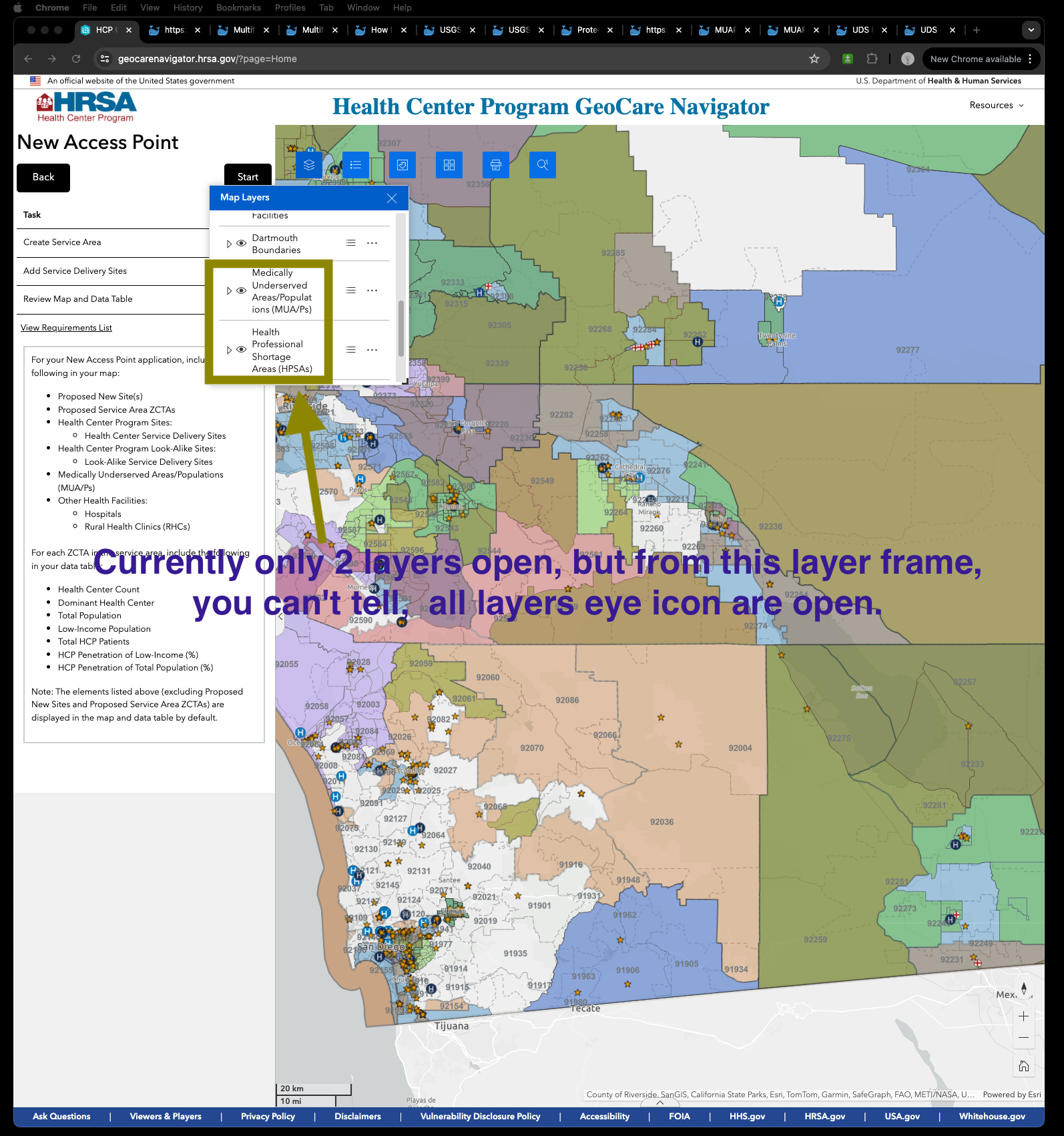
For example, you turn on medically underserverd area polulation layer, first of all, you clearly see which layer turned on right now. Different angle of hash line means different things.
https://transparentgov.net/json2tree/datahub.io/uds/uds_data.html?_center_zoom=9&_center_lat=33.31934619365885&_center_long=-116.60984309491538&widgetopacity=0.9&tooltype=off_select2&showServiceArea=hide&patientsIncluded=34&showHealthCenter=show
Now I add one more layer, primary care service shortage area layer.
https://transparentgov.net/json2tree/datahub.io/uds/uds_data.html?_center_zoom=9&_center_lat=33.266965418651985&_center_long=-116.56824957680723&widgetopacity=0.9&tooltype=off_select2&showServiceArea=hide&patientsIncluded=34&showHealthCenter=show
again, you can clearly tell only 2 layers are turn on.
Most important you can easily find those area which overlapped by both layers.
